Empowering Decisions: Leveraging Big Data and Analytics for Card Portfolio Management

Strategy • Interaction design • Visual design • User Experience • Product definition • Workshops • Concept Design • Client Interviews • Design Evaluations • Design System • Data Visualization • Design Iteration • Delivery
Overview
Fiserv offers global financial technology services for financial institutions. Traditionally, their focus was on features tied to client billing, leading to a complex manual ecosystem with redundancies and a high Total Cost of Ownership (TCO).
I was part of a project to reshape this approach towards a digital, product-centric vision. The goal was to deliver a reporting tool platform with a more seamless experience for the financial institutions it serves and their end-users.
To adhere to my non-disclosure agreement, I have omitted and anonymized confidential information in this case study. All information presented is based on my own work and does not necessarily represent the views of Fiserv. Additionally, all images in this study have been edited for privacy and should not be shared or downloaded without permission.
Client
Fiserv, US
Duration
2 years
Business Goals
Centralize Information
Develop a unified analytics reporting tool that consolidates data, reduces redundancy, and provides clients with a single source of truth.
Enhance Decision-Making
Deliver key metrics and insights in an interactive, intuitive, and visually appealing way to enable clients to make better business decisions.
Accelerate Time to Market
Leverage agile methodologies and cross-functional expertise to efficiently develop and launch the analytics reporting tool, maintaining high quality throughout.
🚧 Challenges
Aligning multiple stakeholders across the U.S. and understanding a highly diverse user base.
Grasping complex financial terminology and key metrics.
Analyzing big data from debit and credit cards to communicate insights and trends visually.
Designing a consistent, accessible experience while establishing robust design principles.
✅ The Solution
Comprehensive end-to-end analytics reporting experience with curated dashboards featuring engaging metrics that enable users to identify trends, visualize changes, and make informed business decisions.
🎯 Method
Design Thinking approach through workshops and stakeholder reviews:
Listening to our clients' needs.
Understanding the mental models that drive their decision-making.
Co-creating the desired experience with them.
Translating their feedback into consistent and intuitive designs.
This iterative process ensured that the final product was aligned with client expectations and effectively met their goals.
📊 Outcomes
Client Acquisition
See a 15% boost in client sign-ups within six months of launching the improved UX, thanks to a smoother and more engaging experience.User Satisfaction
Increase user happiness by 20% through better-organized content, easier navigation, and improved accessibility, as shown in post-launch feedback.Design System Efficiency
Cut design and development time by 25% with a streamlined design system, helping us create consistent and polished designs faster.Stakeholder Engagement
Strengthen collaboration by 30%, thanks to more effective feedback sessions and a shared vision, leading to smarter decisions and better results.
Conduct expert reviews of the previous UX experience, providing insights on improvements in areas such as information architecture, user flows, accessibility issues, and visual consistency.
Analyze feedback from workshops with stakeholders and translate it into design explorations, using these as conversation starters to gather specific input from stakeholders and clients and iterate accordingly.
Lead the CX/UI team in executing and exploring design solutions, preparing designs for hand-off after obtaining approval.
Collaborate with the design strategist by contributing input related to interaction design for interview guides and research documents.
Establish robust design principles based on research from the data platform Tableau.
Role and Responsibilities
The Team
4 UX/UI Designers
1 Design strategist
Various stakeholders
4 Tech Leads
8+ Developers
Problems
01. Complex and Robust Data to Read
70% of users reported difficulty understanding the data presented in previous versions.
02. Finding the Right Visualization for Each Data Point
60% of data points lacked effective visual representation, leading to confusion or misinterpretation.
03. Difficult Financial Terminology
65% of users struggled with understanding industry-specific financial terms, reducing their ability to make informed decisions.
04. Making Each Feature Self-Explanatory
55% of users needed additional guidance or support to understand certain components, indicating a lack of clarity in the design.
Goals
01. Communicate Powerful Insights Through Data
Aim to achieve a 25% improvement in user comprehension as measured by usability testing, indicating clearer communication of insights.
02. Tell a Story with Each Set of Visualizations to Facilitate Focused Reading
Increase the percentage of users who can easily follow and interpret the visualizations by 30%, based on user feedback and testing.
03. Identify and Highlight Risks or Negative Outputs
20% reduction in decision-making errors by clearly identifying and highlighting potential risks, measured through user testing and post-launch surveys.
04. Make Visualizations a Reliable Resource for Decision-Making
35% increase in users’ confidence in making data-driven decisions, as shown in post-launch user surveys and feedback

Co-creating along each stage
The Process
Understand how users think and make decisions and translate these into experiences that allow us to better support them.
01. Product definition workshop.
02. Concept design.
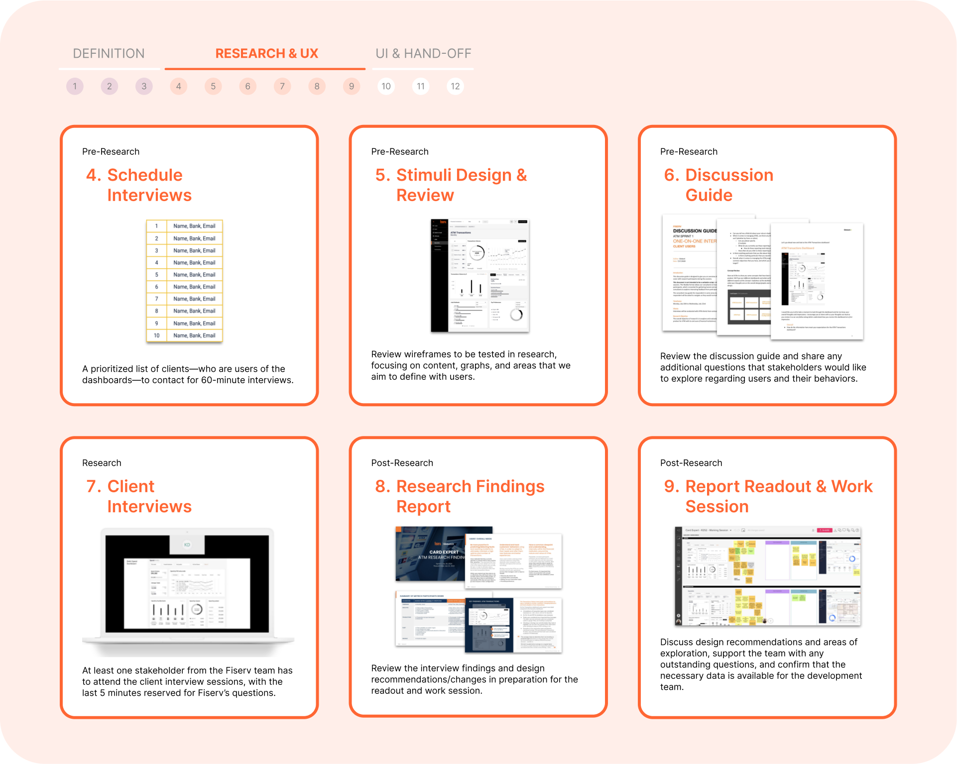
03. Client interviews & Design Evaluations
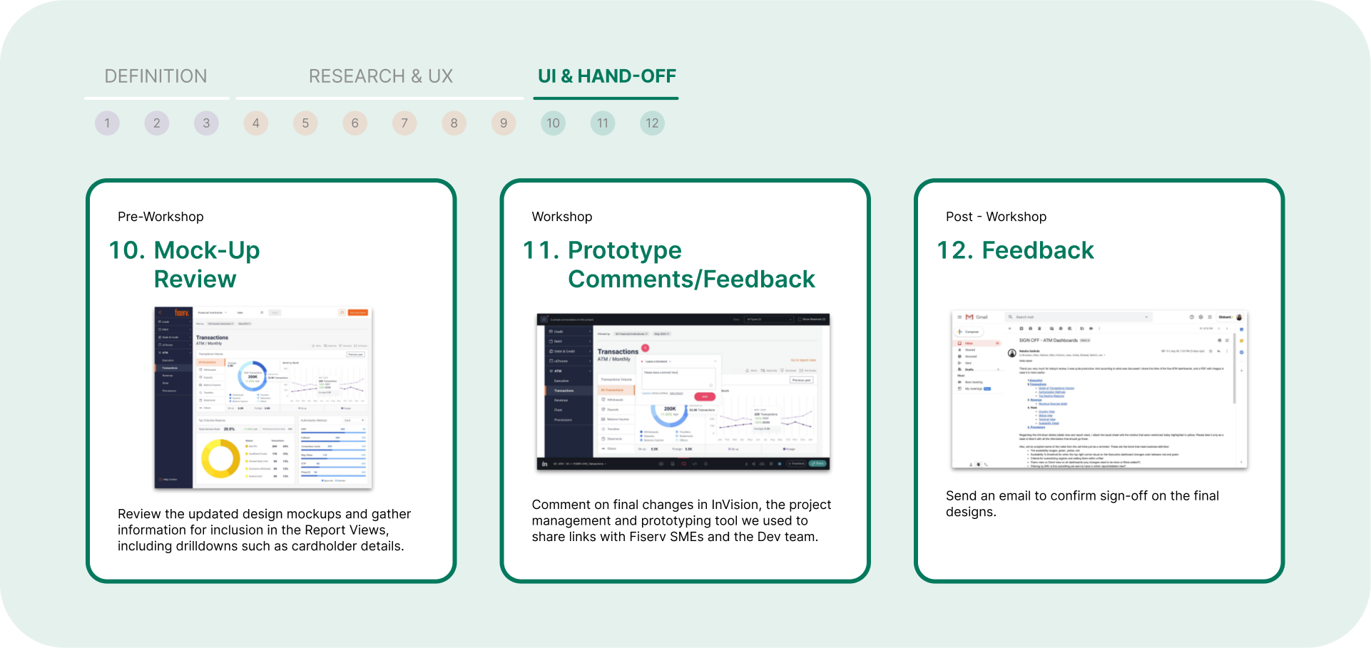
04. Design Iteration & Delivery


-

It all began with a story
Fiserv reports were kind of a hard task for every financial team, so we decided to start from the beginning. First of all, we set out to analyze user roles and define objectives for the product based on their needs.
-

Consistency through a solid Design System
Understanding the Tableau framework, a specific tool for interpreting data and addressing various constraints in UX, allowed us to build, scale, and maintain a system that improves time to market in every Fiserv product and daily tasks.
Implementing Web Content Accessibility Guidelines (WCAG).
-

Design Kitchen, each element in its place
Understanding the data, the exploration process was crucial to ensure we met user needs and anticipated them.
We introduced Design Kitchen, a weekly showcase of all explorations leading to the final solution, fostering innovation and data-driven design, crucial in finance.
-
User experience affects business results
Enabling better experiences for financial institutions.
Making connections across different Fiserv products that provide a more unified experience and offering for Fiserv and its clients.
Consistency across products strengthens the Fiserv brand and creates efficiency in the design and development process.
Creating new revenue streams with new products such as Card Expert has the potential to become new revenue streams for Fiserv.
-
Take aways
Educating the client in the design and experience process is essential to achieve genuine involvement and help them see the value of co-creation.
Understanding the product data being designed, studying it, sharing insights, and arriving at concepts from diverse perspectives were crucial to anticipating user needs.
Documenting each exploration as a kind of 'behind-the-scenes' effort proved instrumental in strengthening the client relationship and fostering trust in the team.